New year, new look

Hard to believe it’s been nearly three years since I’ve posted anything to this site. I’m determined to give this the attention I should this coming year, and it starts with giving the site a new look. I was never quite happy with the last one, and just recently found some performance bugs related to the child theme I built. That gives me a good excuse to start fresh with a new child theme.

Because of how busy life can be, I’m going to try and track my progress with the blog and document the steps I’m taking with rebuilding the theme for this site. Hope you come along for the journey.

Dealing with the Website Monkey

I recently read The One-Minute Manager Meets the Monkey, and lately started looking at just about everything as a monkey. One of the biggest ones has been this website. I’ve been wanting to redesign this site for years, and sketched multiple variations of design and wireframes. However, working full time, having a family with three very active children, and personal activities, there never seemed to be a good time to fully execute the different ideas for this site to the extent that I envisioned them in my head.

I got to the point where the previous version just wasn’t cutting it for me, and I needed to do something — anything. So I played with various templates — both free and paid — as a stopgap measure until I could prioritize the time to do a complete redesign that I could be happy with. The problem I kept running into was that none of the templates that looked appealing would not either allow me to do the customizing that I wanted, or the customization was so convoluted that I was spending more time than I wanted to to try and get it to work the way I wanted it to. The monkey was unruly and needed to be dealt with once and for all.

I finally decided to strip the monkey down to its bare essentials. I decided to use a base child theme and strip the site to its bare bones, and gradually add some meat as I can. So for now, I’m putting in place a basic structure with a few design elements (font, color, images, etc.) and plan to build this up the way I want to, and the way I should have a few years ago. I hope you’ll keep tabs and watch the progress develop. When I get to a point of completion (or at least near-completion), I hope to write about the process. In the meantime, come along for the ride.

Websites That Work: 20 Years Later Part 1

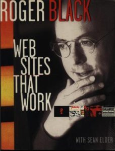
Websites that work cover
It’s been twenty years since Roger Black wrote Websites That Work. It was one of the first web design books I read and influenced my perspective of web design as I was first starting to learn the field. I want to explore how the points he makes throughout the book hold up two decades later. I plan to review each chapter as their own posts, bringing the total number of posts (including this one) to 15.

Let’s begin by taking a look at the introduction and pulling out select comments:

Web sites are even more dependent on good design than print is. After all, even a magazine with minimum design gets its information across. [p. 15]

But web sites are visual: one screen at a time…It is not enough to get people through the front door, to your home page. You have to bring them inside and, once they are in, try not to confuse or frustrate them. [p.15]

Web sites that work are sites that do what you want to do. They don’t insult your intelligence, but neither do they obfuscate. They must indicate the wealth of material that lies behind that first screen, but also allow you options and alternate means of approach. [p. 16]

Even after 20 years, I am amazed that many people, when wanting to plan their website, still have a hard time thinking past the home page as far and content and appearance. They focus on what initially appears, both visually and content-wise, and not about what they want and expect the user to do next. As a designer, I regularly need to challenge clients to think about the experience they want the user to have.

The design industry as a whole has taken this to heart and has grown over the last two decades, but I still see clients struggle with this area. We have come a long way with understanding the user and developing the experience, but we still have a long way to go as well. I’m looking forward to examining how this book holds up after 20 years.

Where You’ve Been, Marv?

Its hard to believe its been over two years since I posted an entry on this site. Time gets away from you when you’re having fun. Since then, I’ve gone back full time to a great company, I’m still teaching my web design class, and raising three kids.

I’ve had ambitions to get this site redone. It’s been stuck on its original theme since 2006. That’s downright ancient in web design. However, with everything else going on, there seemed to never be the time to do anything about it.

The time is now. I decided to follow Jeffrey Zeldman’s lead and design this site live. I’m hoping to have it complete by the new year. I then have some plans to write semi-regularly, which I will share about soon. Thanks for the patience.

Things Have Been Busy for Awhile

Over the past twelve months, things have been quite busy for me, both professionally and personally. During that time – and for me the most important – was becoming a father for the third time. I also began teaching a self-developed class at CCAD aimed toward helping professional print designers transition into web design. This fall will be my third time teaching the semester-long course. On top of those things, I’ve had plenty of work at my full time job building websites, and a few freelance projects thrown in there in case I considered taking a breather.

Because of that, things around these parts have been extremely quiet. I plan to change that soon. I have a backlog of blog ideas piling up that I want to thin out. Also, this site’s current design is about eight years old and long overdue for a makeover. When this current look – version 4 of this site for those that are counting – it was my first real venture into blogging, and first experience with WordPress (WP) and PHP. It didn’t go smoothly. I always felt the design was incomplete, but due to my newness with both WP and PHP, I wanted to get something in place, polished or not. I figured I would have time to come back and put the finishing touches on it.

Later has turned into several years, and my knowledge and skills have improved greatly. Plus web technology, especially CSS and HTML, and improved dramatically. So much has changed that tweaking this design is no longer time worth invested. Instead, I plan to roll out a new design for this site before the end of 2012. If you follow me on Dribbble, you’ve seen a few previews.

A new design was been long in coming, but it seems every time I begin the process, either something more pressing enters the fray, or the direction I was going with the site wasn’t working out the way I wanted it to. However, I was determined this summer to get the ball rolling and not let it stop. The new design is progressing, although slowly. I’ve also been contemplating borrowing a page from Jeffrey Zeldman and launch a new design in an incomplete stage and finishing it live. I’m not decided on this yet, but will post something once I make a decision. Also, follow me on Dribbble and you will get some glimpses of the new design, as well as other projects I’m working on, before they land here.

The Importance of Service

Life, and especially the day job have been extremely busy lately, hence the non-posts for several months. But an interesting thing has happened with some new clients we’ve taken on lately that all center on the quality of service, which is one of the things we excel at at TCS.

Client one responded to a direct mail piece and signed on with us primarily because they couldn’t manage content on their current site themselves, had to pay the provider to do the most minor changes, and didn’t get prompt response.

Client two also responded to the same direct mail piece as client one. They were using a complex, outdated CMS and still couldn’t manage their content the way they wanted to. Their domain name was registered under their current provider, but luckily were able to get that changed to their name. They then suddenly received a bill from their current provider totaling several thousand dollars, saying that they inadvertently undercharged the client the last few years and were looking to now collect the difference. Then a week later, fortunately the day before we were scheduling to launch the new site, the provider turned off their site unannounced.

Client three’s site was hacked and hijacked by a porn site. Their provider was recently bought out by another company, and all but one person from the old staff was fired. They could not get the new company to respond to any customer service at all.

Finally, client four was using a Joomla site, got hacked and had all of their databases completely wiped out. The provider didn’t have  a backup anywhere, and basically told the client that its their problem. That was two months ago.

What do all four of these clients have in common? The problem that a lot of organizations and small businesses have — poor customer service from their provider. This is a strong suit of TCS. Not only do we have a great product and produce excellent, creative work, but our customer service is some of the best out there. It also shows that the cheapest price does not necessarily mean the best value.

I’ve also seen this with some of my freelance clients. I’ve worked on several projects where the initial provider/designer/developer dropped the ball, vanished from the face of the earth, or did a piss-poor job. All because the client was looking for the cheapest price instead of the best value. In the end it cost them more.

How can you avoid this painful experience? Here’s a few tips.

  1. Own your domain. This is one of the biggest headaches clients run into when switching providers. Provider A promises to take care of all the logistics, but registers the domain in their own name. Then, when the client wants to go to Provider B, they run into a legal mess trying to procure their domain, or pay through the nose. If you have your provider purchase your domain, get it in writing that its registered in your, or your company’s name, instead of the providers.
  2. Check references and seek referrals. There’s no better salesman than a satisfied customer. Check with other organizations and businesses who they use, and what they like and don’t like about their provider. If you scout out a potential provider from their site, look for a portfolio or a list of clients. Then contact a handful of those clients. Find out if they still use them, how long they’ve been a client, and what they like and don’t like about them. If you can’t find any recent and/or active clients, there’s a warning sign for you to avoid them.
  3. Compare prices. We compare prices when shopping for cars, computers, and even groceries. Do the same with a web provider/designer. Get a list of services and what you get for your money. Find out what’s one-time fees and what, if anything, is recurring.

Hopefully those tips will save you a lot of headache, time and money.

More blatant rip-offs

Shawn Inman was asked to comment on the services of a web design company, Sprincy. Upon reviewing their work, he came across an interesting observation, his Mint site was apparently designed and built by Sprincy. Apparently, this was news to him, since he was sure he designed and built that site himself.
Its also noted that apparently Jesse Bennett-Chamberlain’s design work for the City Church was not his either, but Sprincy. The same with Cameron Moll’s redesign of Vivabit. Funny how so many designers are getting their work confused with a incredible work done by one group.
Looks like Sony was inspired by Sprincy as well (via Daniel Mall). A double wammy. They not only rip off the Sony site, but claim some of the best known work of some of the best known designers are their own. When will it end?

Five for Friday: 2.20.2009

Plenty of redesign goodness around the web:

White House web site redesigns

Some nice write ups on not only the redesign, but also some new features from Greg Storey.

Involution Studio redesigns

Excellent work from an excellent group of folks. Even more impressive when viewed next to their new brochure as well.

ESPN redesigns

Mike Davidson has a nice write-up on his impressions of the new design. I agree with just about everything he says.

Mike Davidson redesigns

Speaking of Mike, he recently rolled out a spiffy new design for his personal site. Lovely.

Mets drop the ball with stadium patch

The only non-redesign in the bunch, but too good to not have. One of the lamest patch designs in history.

Five for Friday: 1.2.2009

I hope everyone had a great Christmas and wrap up to 2008. mine was pretty enjoyable, although hectic with two young girls in the house and traveling to visit family. 2008 was a busy year for me, so I thought I’d kick off the new year’s Five for Friday series with five projects I wrapped up over the last quarter of 2008. These are all web sites I completed at the day job as lead (meaning sole) web designer and developer atTCS Software. All sites are built using ourRuby-On-Rails-driven WebSuite2 CMS.

National Career Development Association (NCDA)

Screenshot of NCDA web site
Launched in early December, the NCDA site redesign was a major challenge and undertaking. Not only did we need to work with the client in reworking the content structure, but this is the first site using the Products Module, WebSuite2’s custom shopping cart. The early feedback from members indicates that the relauch exceeded expectations.

National Association of Drug Diversion Investigators (NADDI)

Screenshot of NADDI web site
The NADDI redesign was an interesting project. The previous version of the site was fairly dark in appearance and mood, and the navigation structure was rather difficult to sort through. We worked with the client to steamline their content structure and made the site warmer in feel. The home page also better organizes their important content without seeming cluttered.

Ohio Automobile Dealers Association

Screenshot of OADA web site
TCS Software was contracted by OADA to redesign their web site to be more engaging, visually more appealing, and easier to use. Along with a complete design makeover, the backend improvements to this site is what really makes it zing, especially the member management features.

Payments Central

Screenshot of Payments Central web site
A slight redesign of a current client, the Payments Central web site doesn’t seem much different from the version that ran on our previous CMS. The real difference is on the back end. The CSS structure is significantly cleaner than the previous version, which was about three years old. There are also additional features that came along with the new CMS, including a true sitewide search and better member login and management features. This is also the second site to use our new Prodcuts Module. On the visual side, the home page is better organized and uses the space much better than the previous version.

Association for Financial Technology

Screenshot of AFT web site
A complete overhaul of their previous site, AFT jumped to TCS Software to have a true CMS system for their site content. Not only is the site appearance a vast improvement over its predecessor, but the interactivity greatly enhances the site’s usability and value.

This is a small sampling of the work I’ve been doing at TCS Software this past year. Overall, I’ve been pleased with the work our team has produced, and the vast majority of our clients are great to work with. You can see more of my work at TCS Software at TCS Labs in the upper right rotating portfolio. All but three or four of those sites were designed and built by me. This year, I also plan to post some write-ups of the creative process on some of those projects as well as some new ones that are currently in the works.

Five for Friday: 12.26.2008

Obama logos that weren’t chosen

Interesting look into the process that created the highly-recognizable Obama Campaign logo.

Design contest debate

Steve Douglas, founder of The Logo Factory, responds to some issues brought u[ about the legitimacy of logo design contests. On the other side of the ring, George Ryan, who made the original post Steve responds to, offers his rebuttal in the comments.

Content. Content. Content.

What’s the most important part of a web site? Content. A List Apart @274 focues on that verytopic.

Font Conference

Hillarious clip, especially if you’re a typeface geek like me.

Recession Tips For Web Designers

Great tips from Jeffrey Zeldman and 24 Ways.