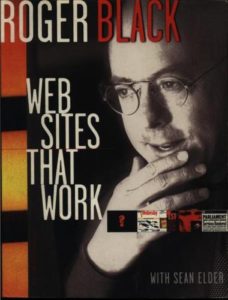
Websites That Work: 20 Years Later Part 1


It’s been twenty years since Roger Black wrote Websites That Work. It was one of the first web design books I read and influenced my perspective of web design as I was first starting to learn the field. I want to explore how the points he makes throughout the book hold up two decades later. I plan to review each chapter as their own posts, bringing the total number of posts (including this one) to 15.
Let’s begin by taking a look at the introduction and pulling out select comments:
Web sites are even more dependent on good design than print is. After all, even a magazine with minimum design gets its information across. [p. 15]
But web sites are visual: one screen at a time…It is not enough to get people through the front door, to your home page. You have to bring them inside and, once they are in, try not to confuse or frustrate them. [p.15]
Web sites that work are sites that do what you want to do. They don’t insult your intelligence, but neither do they obfuscate. They must indicate the wealth of material that lies behind that first screen, but also allow you options and alternate means of approach. [p. 16]
Even after 20 years, I am amazed that many people, when wanting to plan their website, still have a hard time thinking past the home page as far and content and appearance. They focus on what initially appears, both visually and content-wise, and not about what they want and expect the user to do next. As a designer, I regularly need to challenge clients to think about the experience they want the user to have.
The design industry as a whole has taken this to heart and has grown over the last two decades, but I still see clients struggle with this area. We have come a long way with understanding the user and developing the experience, but we still have a long way to go as well. I’m looking forward to examining how this book holds up after 20 years.
